
Brand Guidelines
This is a guide to the language and design elements that make up the Roaring Brook identity. It includes advice, templates, and sample executions that demonstrate how to bring our brand to life.
Logos
This logo is the guiding post for the Roaring Brook brand. It is our primary logo for all communications.
The Roaring Brook symbol derives from the idea of a ripple, the effect that one good decision can have on others.

The secondary logo should be used in spaces that require a linear format.
The Roaring Brook recovery logo should only be used in instances without context, such as sponsorship opportunities.
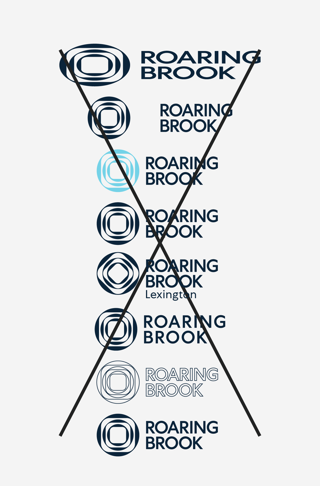
1. Do not stretch or skew the logo.
2. Do not pull apart the logo.
3. Do not color the logo.
4. Do not rotate the logo.
5. Do not add elements to the logo.
6. Do not adjust letter spacing in the logo.
7. Do not outline the logo.
8. Do not add drop shadows to the logo.
Colors
Color has enduring emotional appeal. By pairing the colors consistently, you can reinforce brand recognition.

Deep Blue
RGB 11 / 36 / 58
CMYK 100 / 57 / 9 / 52
Pantone 7694
Hex #0B243A

Aqua
RGB 116 / 210 / 231
CMYK 50 / 0 / 12 / 0
Pantone 2197
Hex #74D2E7
Color works differently in print than on screen, so you’ll need different color codes for each.
Pantone (PMS)
The Pantone system is used for precise color matching – you can give a Pantone reference to any printer, anywhere, and they’ll print the exact same color.
CMYK (Cyan/Magenta/Yellow/Black)
The print files will be delivered in CMYK color mode, which is suitable for commercial full color and everyday printing.
Note: If you try placing a CMYK file into a Microsoft Office program and the image doesn’t display correctly, try the RGB version.
RGB (Red/Green/Blue)
These colors are used in monitors, television screens, digital cameras and scanners. Digital logo files are in RGB color mode.
Hex (Hexadecimal)
This six-digit code is associated with websites, viewed on a screen, and refers back to the RGB color.
Typography
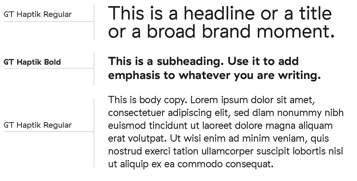
Fonts express as much as words. They convey feeling, establishing a consistent and ownable visual language for Roaring Brook.
We use the GT Haptik type family. Using its weights consistently yields a unique visual voice.


Symbol Extensions
The symbol can be used as an overlay with photography to extend the Roaring Brook brand.

Photography
Intentional photography in a consistent style enhances our brand. Our photography should illustrate why life in recovery is better.
To do this, we should show diverse groups of people receiving support and encouragement from their peers, showing up for their family, and giving back to their community.


Language
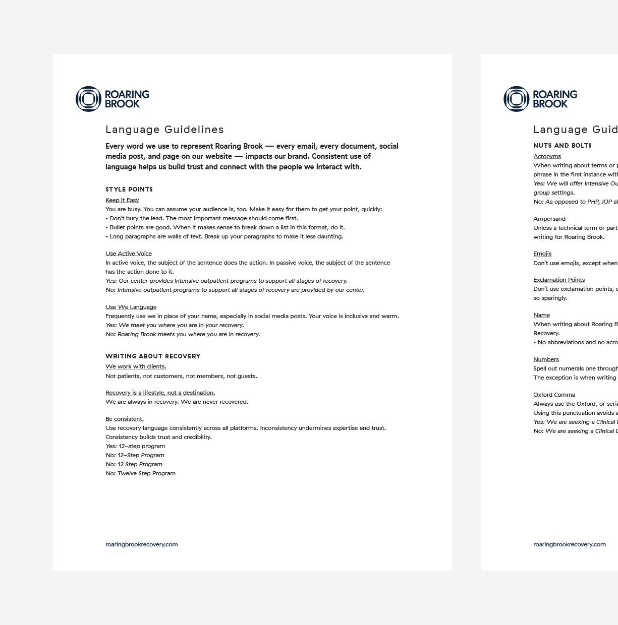
Every word we use to represent Roaring Brook — every email, every document, social media post, and page on our website — impacts our brand. Consistent use of language helps us build trust and connect with the people we interact with.
Download the full language guidelines for recommendations on style, vocabulary, and mechanics for telling our story.
Our core values guide the important decisions: who we hire, when we fire, what building we buy, what service we provide, and, to whom. They are the foundations of all the other language our company uses. They are reflected in our name and visual identity. At least, they should be. They literally define us.
Use them to create headlines to be used in print and online.
We believe:
Everyone is deserving.
There is always hope.
Support should challenge.
Everyone’s journey is different, but together we heal.
You must surrender to win.
We meet you where you are in your recovery. We get to know you and your story to build an evidence-based treatment plan that will give you the tools to live fully, for life.
To use under the Roaring Brook name when clarification is needed.
Recovery
To use as a condensed pitch.
Live fully, for life
Collateral
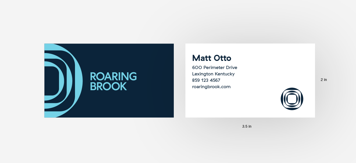
Use this template when making standard 3.5” x 2” business cards.
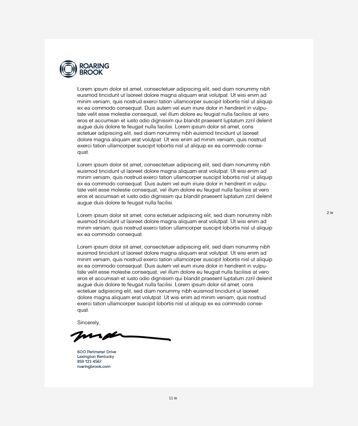
Use this template when making 8.5” x 11” letterhead.
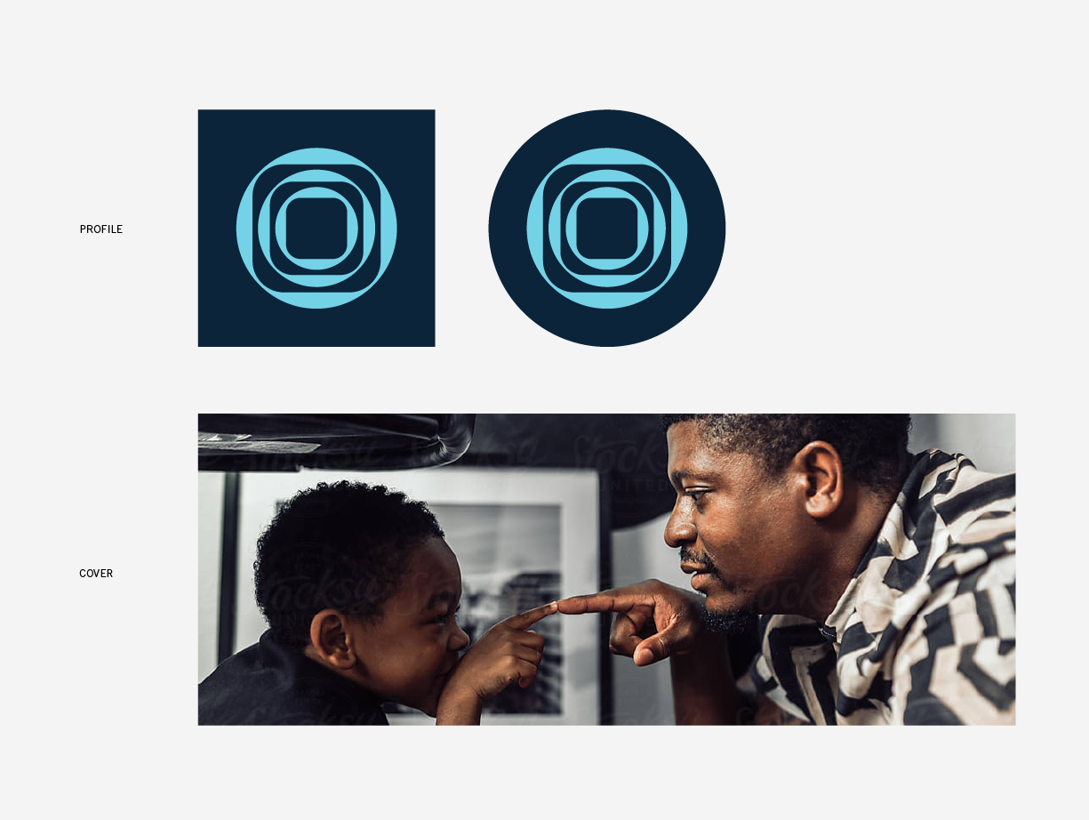
Use these images on all Roaring Brook social media platforms.
Thank you.
Questions?
Victor Rivera
victor@roaringbrookrecovery.com
